Hiringmaster : Product Design for Recruitment Management
2020.10-2022.01
Product designer
Hiringmaster is an HRIS (Human Resources Information System) software developed by ZSoft Consulting, designed to help companies manage their recruitment processes efficiently. Delivered as a SaaS/cloud-based solution, it includes tools for job posting, candidate tracking, and internal collaboration.
Responsibilities
Design strategy, Research, Conception, User flows, Ideation, Prototype
shipped outputs
Saas solution, Landing page A Design System,
TIMELINE
1.5 ans concept design + developement
Team
A product owner, 2 engineers
Summary
The Problem
Originally built for Zsoft Consulting’s internal hiring needs, the tool supported a company with frequent recruitment and high turnover. However, HR teams struggled with scattered tools, uncentralized candidate data, and poor collaboration between hiring managers. These issues led to low efficiency and a poor candidate experience.
Zsoft decided to upgrade the tool into a SaaS product completely tailored for small and mid-sized businesses.
The Solution
Hiringmaster offers an all-in-one recruitment management platform that streamlines the hiring process from job posting to onboarding. It centralizes all candidate data, automates workflows (like interview scheduling and evaluation), and facilitates internal collaboration.
The tool is accessible to HR teams, hiring managers, and executives alike, providing a clear, customizable dashboard and real-time tracking of recruitment performance.


Research
Challenges
Revamping an existing internal system with a refreshed visual identity interface, improving current features, and introducing new modules based on real user flows and scenarios.
Business & Design Requirements
Build a flexible platform for small to mid-sized businesses with diverse hiring needs.
Balance rich functionality with a simple, intuitive experience for all users.
Unify job posting, candidate tracking, evaluation, and onboarding into a seamless workflow.
Build a scalable design system to support future features.
Create a logo and visual identity.
Develop a full Design System and update all interface components.
Design a conversion-focused landing page for the public launch.
Recruitment Journey Insights
To better understand the real needs of HR teams, we collaborated closely with in-house recruitment professionals and conducted a focused HR focus group workshop. Together, we mapped out the end-to-end recruitment journey, from job creation to position closure.
This journey framework outlines each step of the recruitment lifecycle, detailing the user's goals, key tasks, emotional states, pain points, and opportunities for improvement. These insights became the foundation for identifying critical friction points and shaping feature priorities in our product development.

IDEATION
Brainstorm – Pains & Benefits
Together with the internal HR team and Product Owner, we conducted a series of brainstorming workshops to analyze feedback on the existing recruitment process, current tool limitations, and relevant market benchmarks.
These sessions helped us identify key pain points and define potential solutions across several focus areas. Using Roadmunk, we prioritized feature requirements, structured a product roadmap, and established a development timeline.
The identified areas of focus include:
1. Jobs & Processes: Streamlined job creation and onboarding through standardized templates and guided workflows.
2. Candidate Acquisition / Sourcing: Support for bulk candidate import, job board integration, and intelligent duplicate detection.
3. Candidate Management: A centralized system for candidate profiles with clear status, tagging, and activity history.
4. Candidate Evaluation: Tools such as scorecards, and shared feedback forms to improve assessment.
5. Activities Management: Recruiter dashboards, and integrated task tracking.
6. Team Collaboration: Shared views, internal comments, and real-time updates to support collaborative decision-making.
7. Strategic View (Global): Analytics dashboards offering insights into conversion rates, recruitment timelines, and sourcing channel performance.
Information Architecture
As a freelance product consultant, I translated our feature prioritization into an initial product architecture and development timeline. The design and development process was structured in three phases.
In Phase 1, we focused on building the core modules: Projects, Candidate Management, and Activities.
The Projects module enables streamlined job creation and monitoring, from posting to pipeline tracking.
Candidate Management consolidates candidate profiles, tracks application statuses, and facilitates easy filtering and communication.
The Activities module helps recruiters stay organized with calendar integration and task management.
Phase 2 expanded the product’s capability by integrating Candidate Sourcing tools and developing the Candidate Evaluation module.
In Phase 3, we introduced high-level features such as the Strategic Dashboard for analytics and Team Collaboration tools to support shared workflows and internal communication.
Includes supporting features such as workflows, messaging, and notifications to streamline operations and improve cross-team coordination.

Wireframes
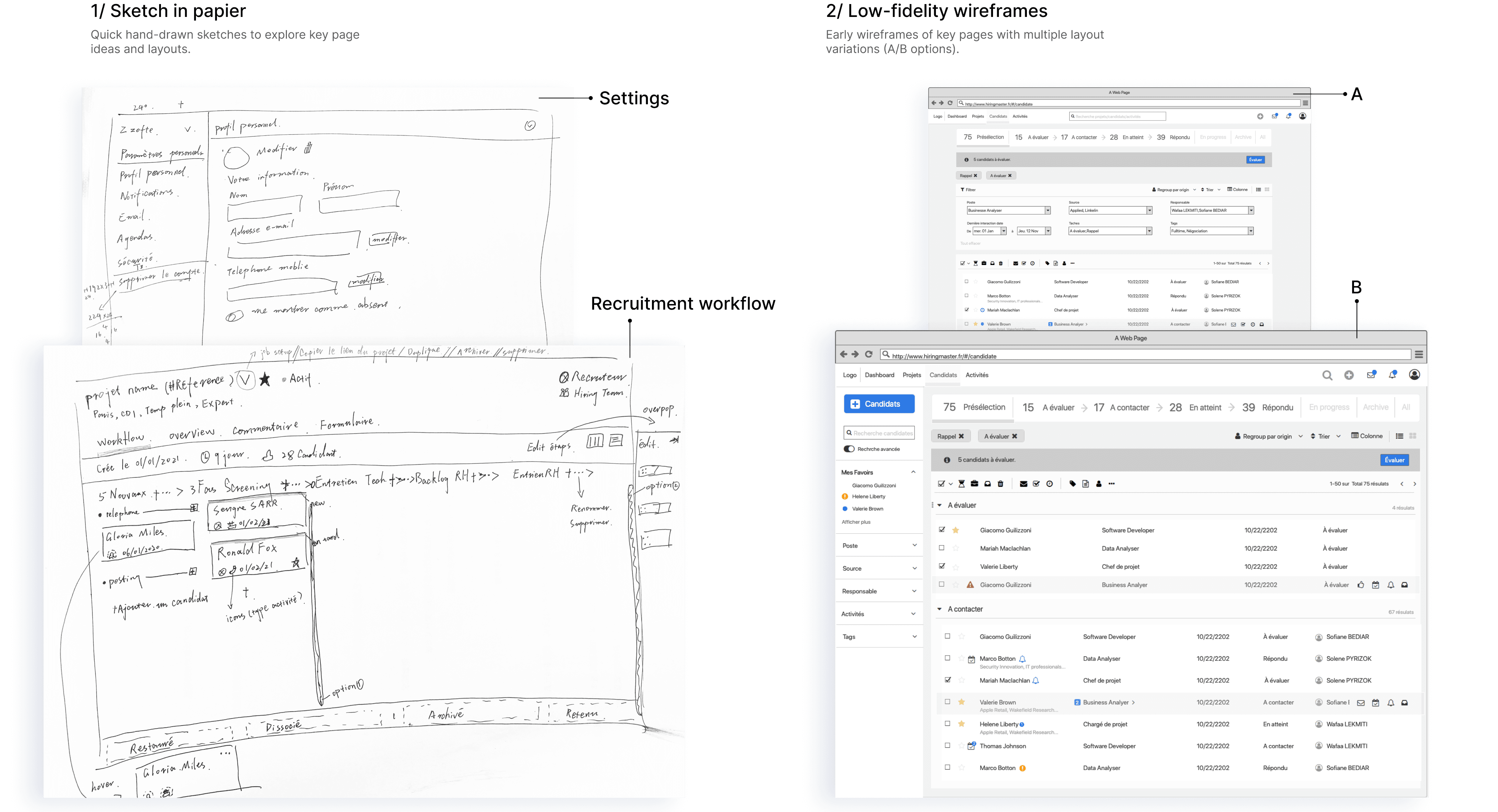
Sketch on Paper
We started with quick hand-drawn sketches to explore key page ideas and layouts. These rough visuals helped bring structure and functionality into focus early on, allowing the team to quickly align on layout decisions and gather feedback before moving into digital design.
Low-Fidelity Wireframes
To explore layout variations, we created A/B wireframe options for major pages, helping guide UX decisions early on.
However, since wireframes sometimes led to design misunderstandings or unnecessary detail discussions, we quickly transitioned to building a design system and moved directly into high-fidelity wireframes to streamline the process and ensure visual consistency.
dESIGN
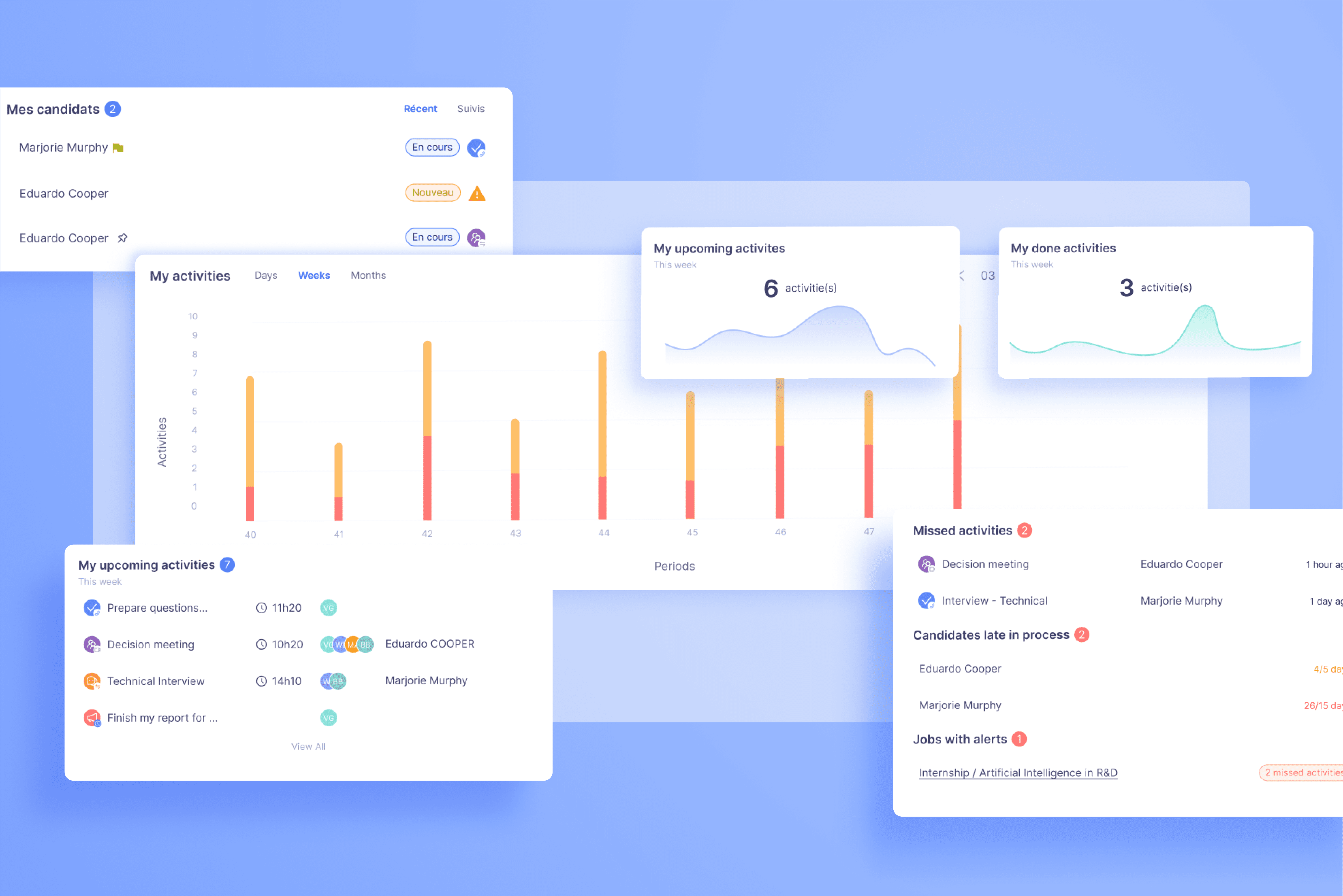
Feature Redesign and UX Optimization
Following a series of focus groups, brainstorming sessions, and close collaboration with the product owner, we led a comprehensive redesign of several key modules in the recruitment management platform. The main goals were to improve transparency across hiring workflows, streamline information structure, and enhance the overall usability for both HR teams and hiring managers.
We rebuilt the information architecture in Figma, restructured the navigation, reduced visual clutter, and clarified hierarchy. Key improvements include:
Post Management: Added a guided job creation flow with templates, created an overview page summarizing job status, publishing channels, and hiring steps. Enabled multi-channel posting (e.g., LinkedIn, Indeed) and implemented a visual workflow to track candidate movement through the funnel.
Candidates Management: Unified the candidate profile into a single-page view combining evaluations, activities, and files. Introduced a visual progress bar to indicate pipeline stages and redesigned tag and action buttons to increase clarity and speed.
Activities: Introduced a centralized activity hub with categorized filters (interviews, meetings, tasks, reminders) and direct links to associated candidates or jobs.
Dashboards & Reporting: Designed a new overview dashboard summarizing key hiring KPIs and team activity. The reporting module offers customizable data views for comparing team performance, candidate sources, and current pipeline distribution.
Collaboration Wall: Added a comment wall per job for internal communication with @mention support, enhancing collaboration across stakeholders.
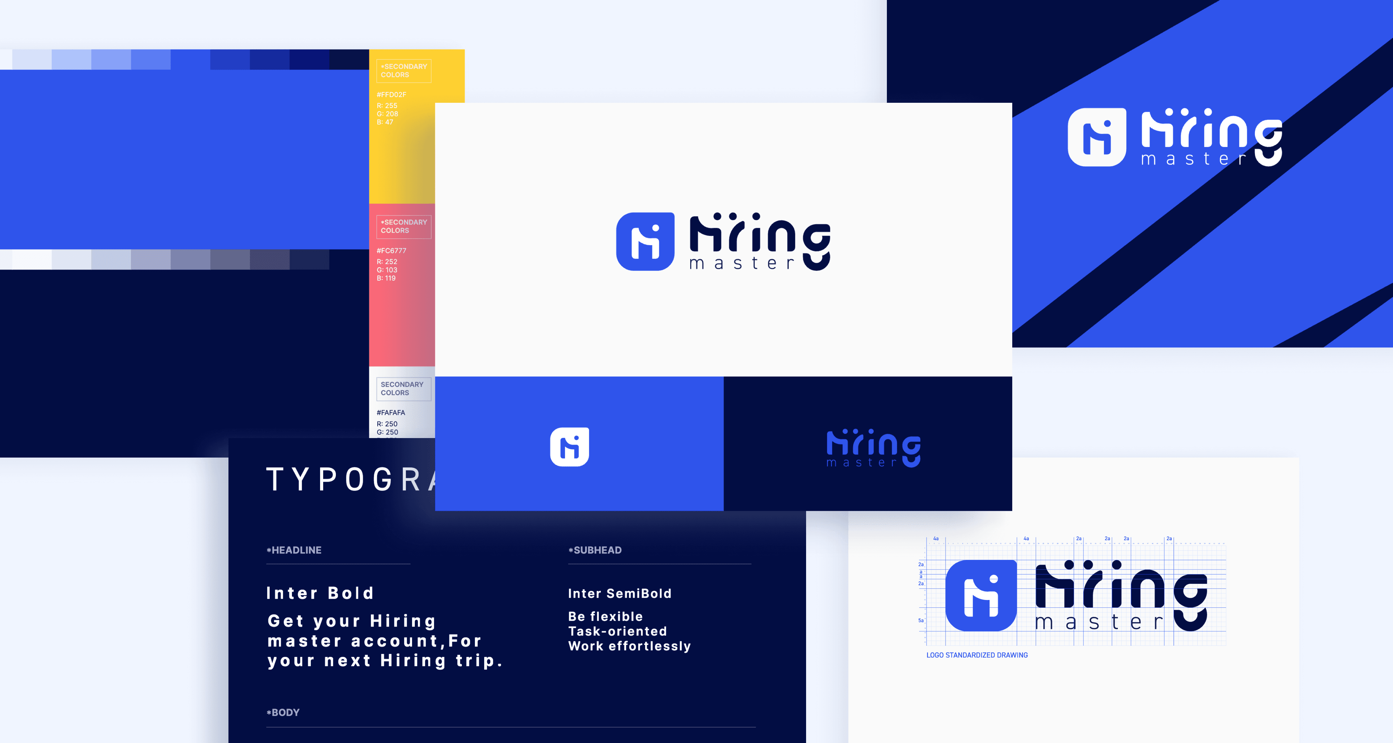
Branding design
For Hiring Master’s initial visual identity, we selected blue and deep navy as the primary colors to convey trust and professionalism. Yellow and coral pink were added as accent colors—creating a dynamic and modern palette that stands out in the competitive talent acquisition (ATS) market.
The original logo is a custom typographic treatment of the word “Hiring,” where the letters “i” and “r” were subtly shaped into abstract human figures—representing connection, communication, and collaboration at the core of the hiring process.
As the product later expanded to the Algerian market, Zsoft adapted the branding with a redesigned logo to better reflect local culture and ensure stronger market relevance.
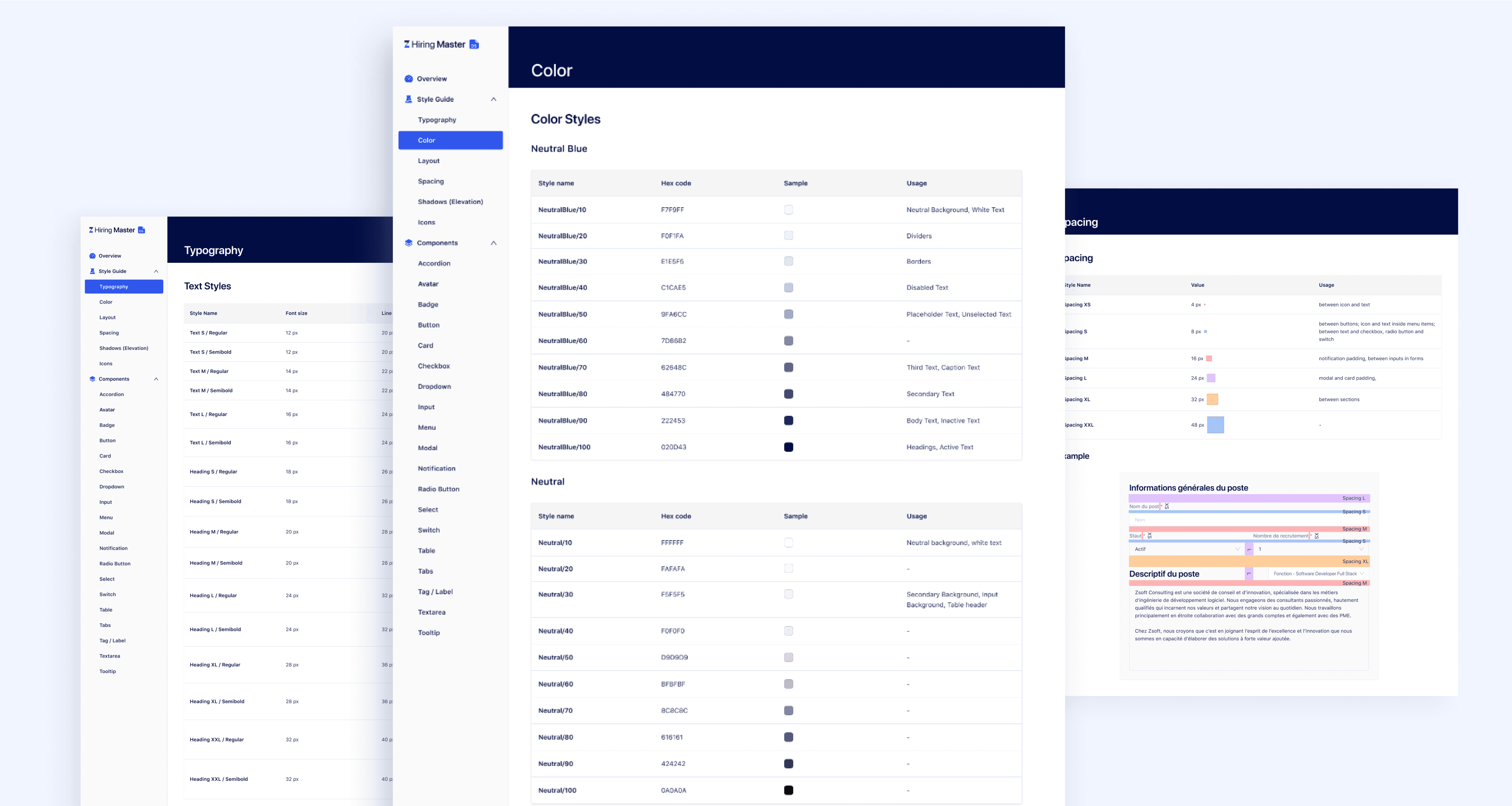
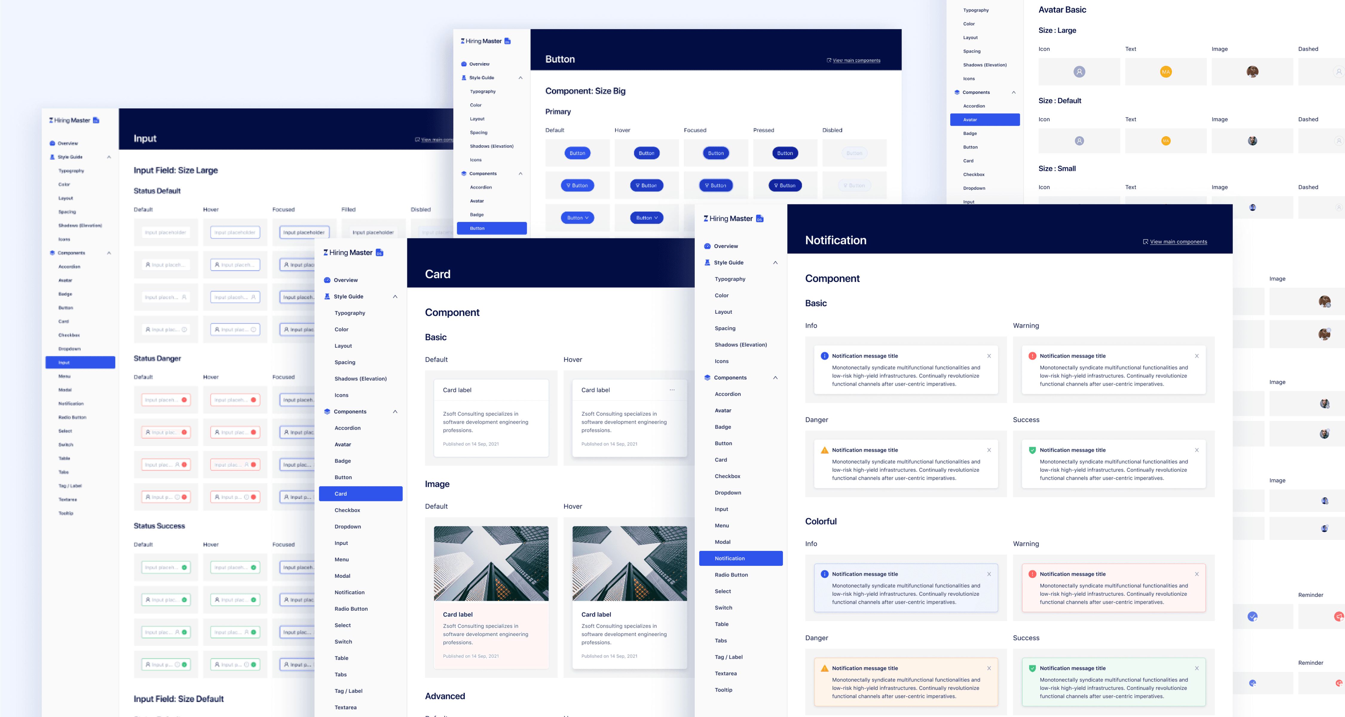
Design system
As part of the platform redesign, we replaced the outdated visual system with a new, scalable design system built on top of Ant Design.
We tailored Ant Design’s foundations to better match our product’s branding and UX goals—customizing typography, color palettes, spacing rules, and over 20 UI components (e.g., inputs, modals, cards, and notification styles). These visual refinements ensure consistency across modules and make it easier for the team to build, iterate, and maintain the interface across multiple future product expansions.
This updated design system now serves as a central reference for both designers and developers, speeding up collaboration, reducing redundancy, and supporting a more unified product experience.
Branding
Design system - Style Guide
Design system - Components
Landing Page Design
The first version of the landing page focused on clearly communicating the product’s value to potential users.
It highlighted core features, explained key benefits, and guided visitors through the recruitment platform’s main modules—such as job posting, candidate tracking, and team collaboration.
The design used clear visual hierarchy, consistent branding, and concise messaging to support product awareness and conversion during early-stage promotion.