Improving the OpenTable reservation experience
2020.10
Case study
Enhanced the user experience for OpenTable, an app that simplifies restaurant reservations, by integrating friends' reviews directly into the booking process. Leveraging trusted personal recommendations helps users make confident dining decisions, driving higher engagement and increasing overall bookings.
Responsibilities
User Research, UX & UI design, Prototype and testing
shipped outputs
Optimized 4 main pages with the new features, User testing and feedback
TIMELINE
2 weeks design conception
Team
3 product designers
Summary
The Problem
OpenTable is facing a challenge in increasing booking rates. The app currently lacks the functionality to connect existing users with their friends. OpenTable's goal is to make it easy for repeat users to connect with their friends and their restaurant reviews. The aim is to increase booking conversion rates from a business perspective.
The Solution
To address this issue, we focused on enhancing the user-friendly experience and introducing a feature that includes friends' ratings and recommendations. This is aimed at increasing the booking volume on the OpenTable app and trust in restaurant recommendations.
After conducting a usability review, competitor benchmarking, improving user flows, and rapid wireframe design, we focused on the following three solutions:
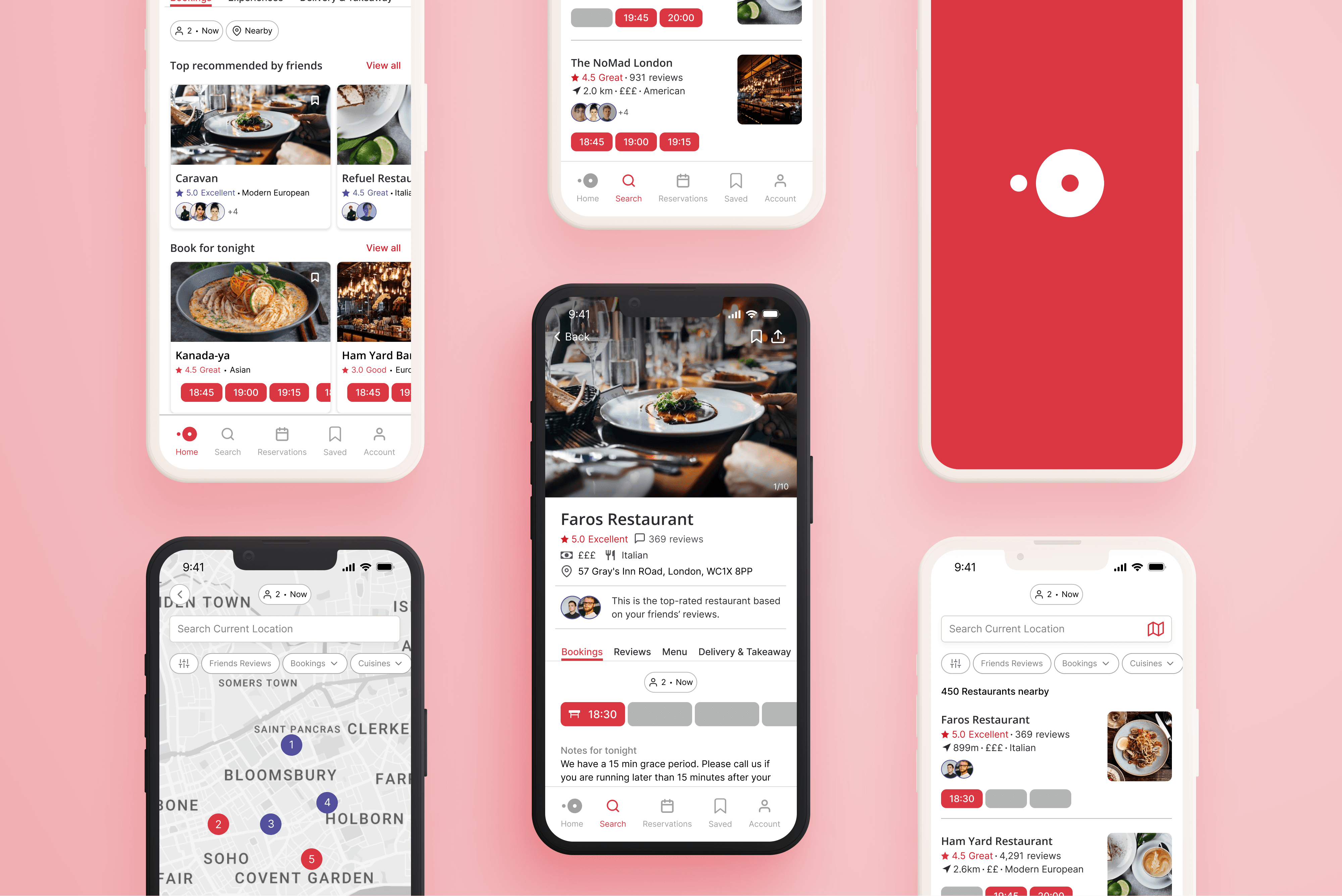
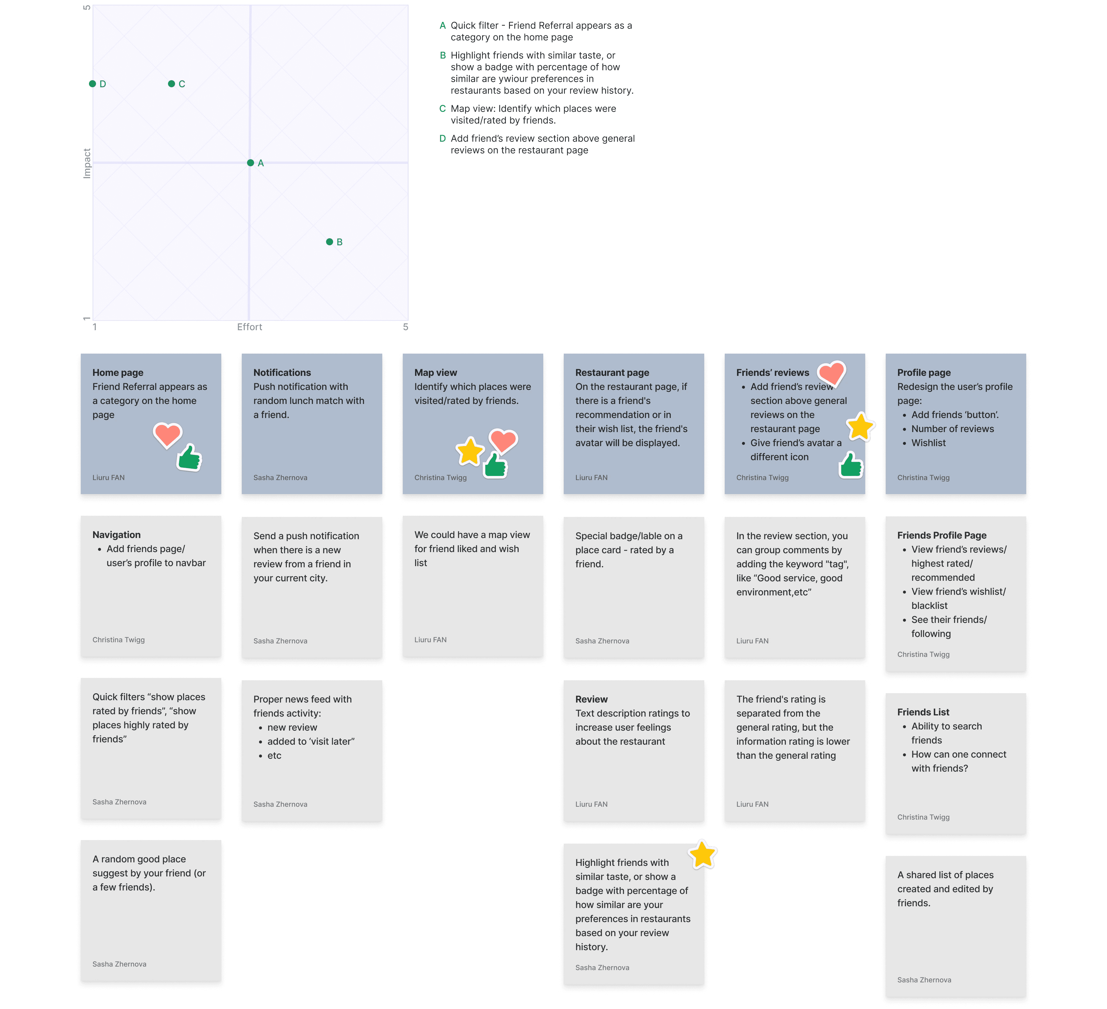
First, we introduced a new section ”Top recommended by friends“ on the homepage, providing users with a quick way to access restaurants their friends have tried and their recommendation reviews. This section displays restaurants ranked by friends' recommendation scores from high to low. Users also have the option to turn off this feature in the settings.
Second, we made improvements to the search and map tools. While enhancing the user search experience, we added a friends' review filter option and made more targeted and refined search queries based on dining locations, prioritizing the display of friends' latest reviews on the restaurant preview cards.
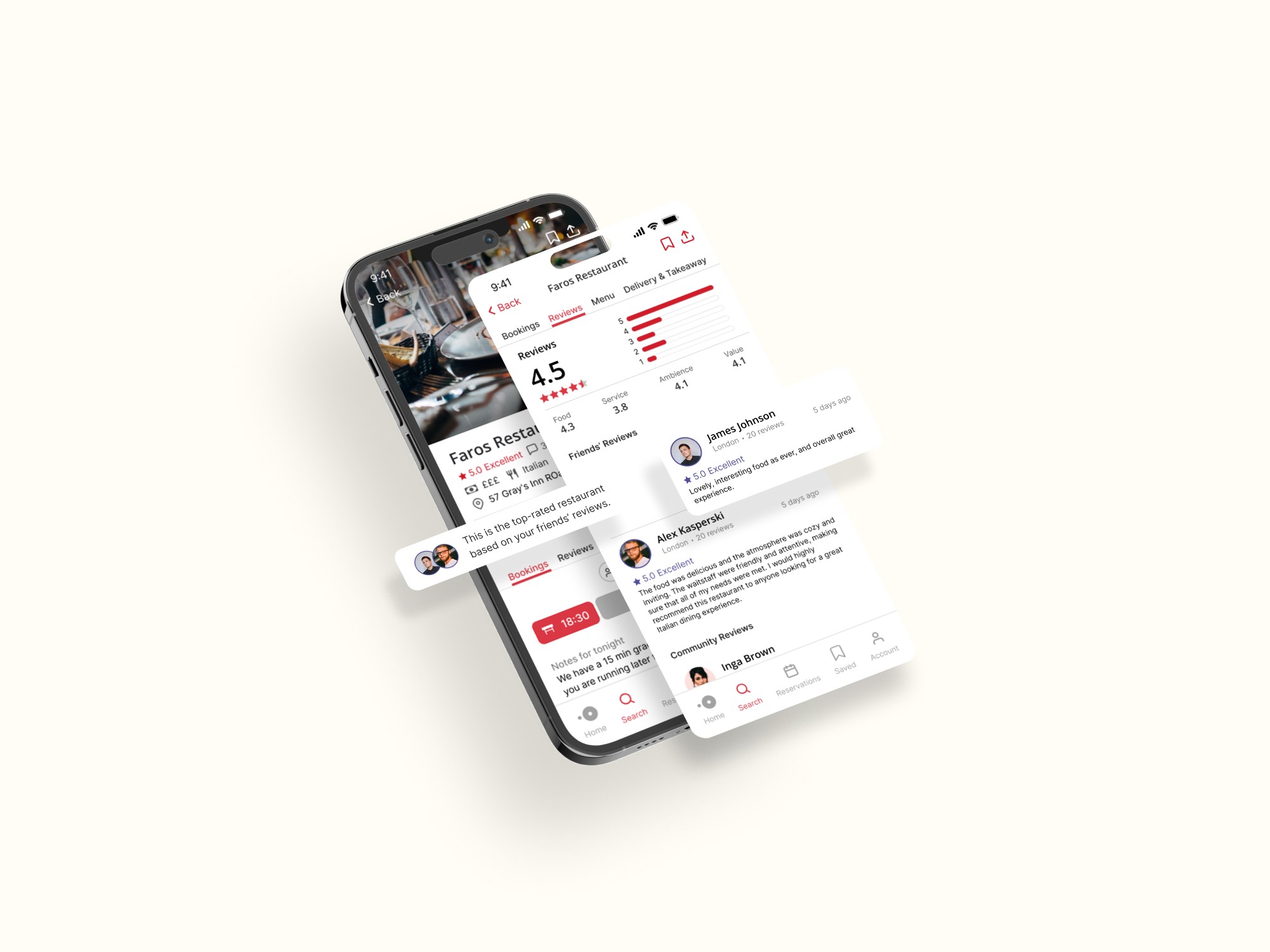
Lastly, we restructured the restaurant detail page, optimizing the hierarchy: simplifying restaurant information, adding traces of friends' recommendations, and prioritizing friends' reviews. Additionally, in the UI, we differentiated the colors of friends' reviews and regular user reviews.


Research
Challenges
What challenges is OpenTable facing in increasing booking rates and how does it plan to address these issues?
Usability Review
After conducting usability tests, we identified some challenges users face when using the app, as well as some standout features that they appreciate.
Pain Points:
The page content is overly abundant and crowded, with an unclear hierarchy, making it difficult for users to focus and find relevant information.
Users feel overwhelmed by the multitude of Call-To-Action (CTA) buttons on the page and the uniform page layout.
The review page is complex and not user-friendly.
The repetition of booking information and suggested booking times can lead to user fatigue.
Wow moment:
The app quickly displays essential restaurant information that users need, such as price, food type, restaurant address, and available reservation times.
The feature to set up an alert if a time slot becomes available is a nice touch that users appreciate.
Users can see the overall ratings of the restaurant in different aspects, such as food and service, with added features like time and filters.

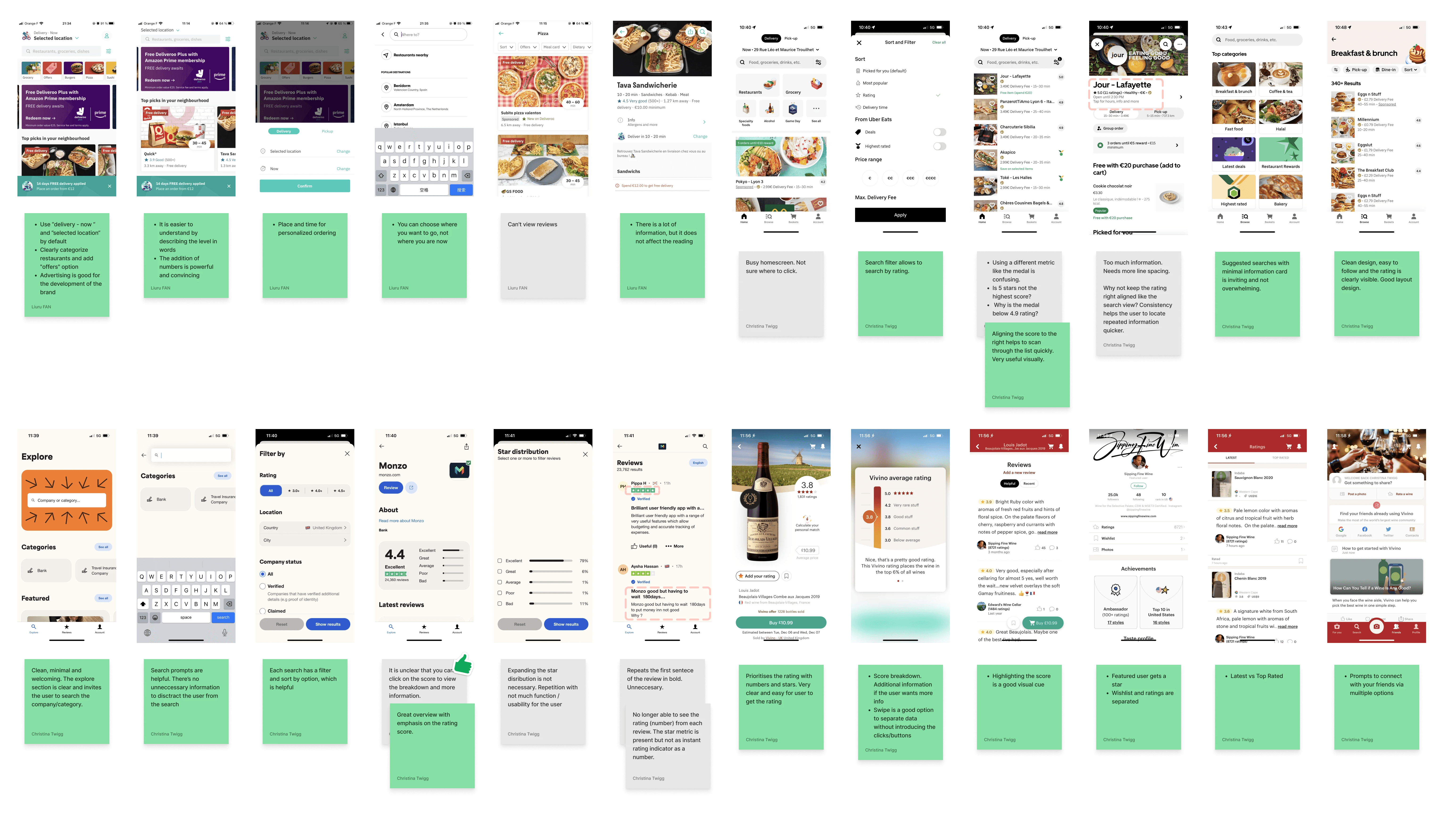
Competitor Benchmarking
A thorough study of OpenTable's direct and indirect competitors helped us to provided much inspiration and showed that there are many solutions to a problem: e.g. minimalist design, clarity of hierarchy, importance of search, filtering options, rating systems, etc.
Direct Competitors: Tripadvisor, Michelin Guide, Yelp, The Fork

Indirect Competitors: Deliveroo, Uber Eats, Trustpilot, Vivino
IDEATION
Existing feature and new feature
During the ideation process we grouped all ideas into two categories: improving an existing feature of an existing design/process or adding a new feature. And we brainstorm and prioritise by using mind maps and priority matrices. These methods help us find the balance between the most impactful solution and time cost.
Mind map
Priority Matrix
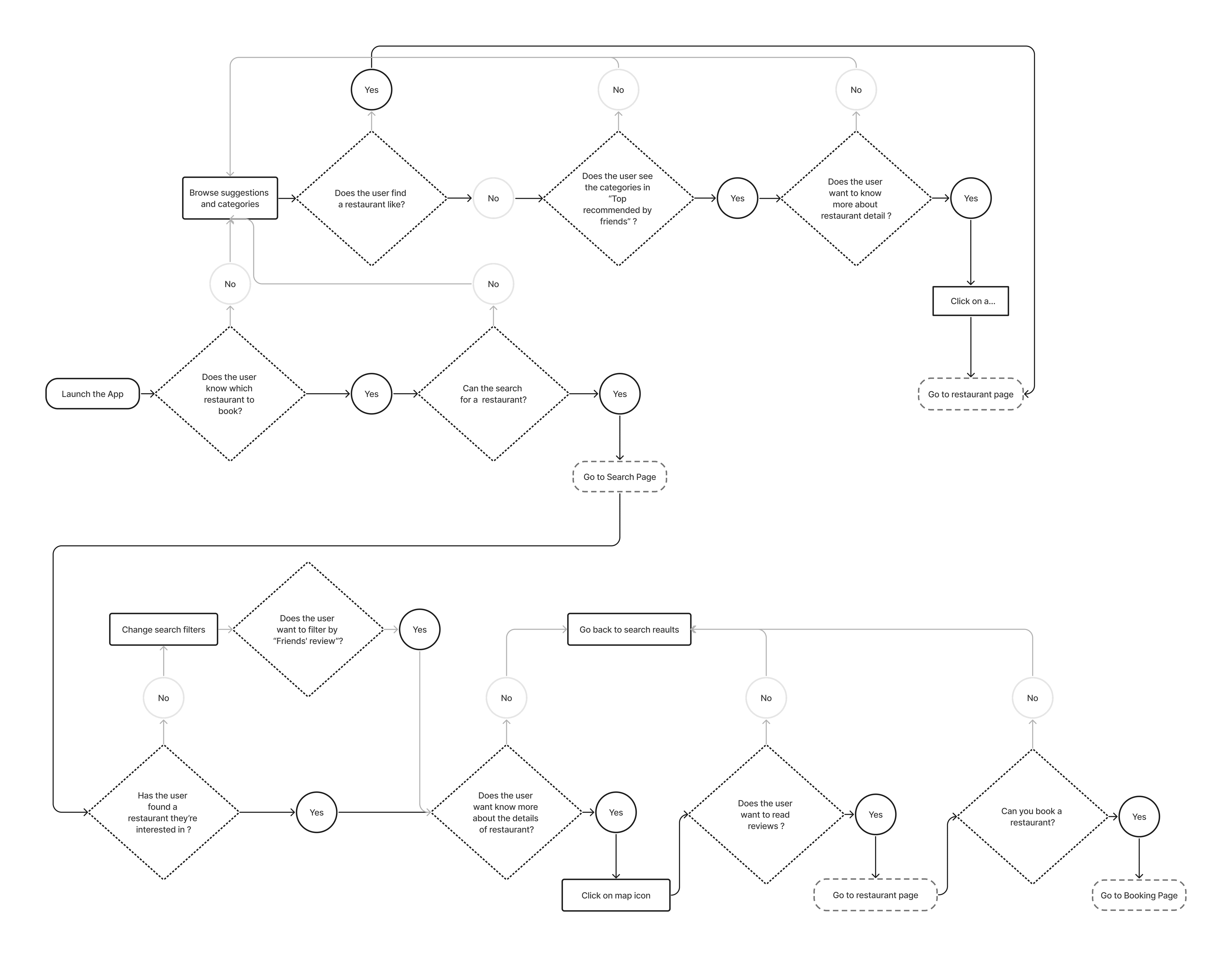
User Flows
We mapped the existing user flows to to really understand how users interact with the product to identify potential pain points in the user journey. We then mapped a few of the highest priority ideas through an improved user flow, which allowed us to visualise the ideas within the user flow.
dESIGN
Test and Review ideas
Use low-fidelity sketches to test ideas, and high-fidelity models for execution.
Rapid Prototyping
Combining the crazy 8's method, and an improved user flow as a guide, we quickly sketched out different wireframes to test our ideas.After we reviewed the strengths and weaknesses of each other's ideas, and voted on the best solution, we further collated the low-fidelity wireframes to identify a structural framework that our team was happy with.
Crazy 8's

Low-fidelity wireframes

High Fidelity Prototype
After completing the high-fidelity wireframes, we created and tested multiple versions of a design prototype in Figma. Interacting with the prototype allowed us to quickly review the design and ensure that our proposed solutions addressed the defined problems.
-Adjusted the information structure of the homepage and redesigned it: we added a new section titled 'Top recommended by friend', and redesigned the restaurant cards.
-Optimized the search function: we added a a friends' review filter option, and restaurant location en different color.
-Improved the information hierarchy on the restaurant details page: we simplified the restaurant information, added a friends' recommendation feature, and prioritized reviews.
-Add Friends profil page with the restaurant liste.
tESTING
Testing and Feedback
We conducted a usability test using Maze to guide the tasks they needed to complete. This helped us understand how real users interact with our solution.
Usability Testing
It allowed us to identify the pain points in our design and determine the overall success rate of user interactions. You can read the full report here.
Test outcomes
Usability testing showed that overall ratings and friends' recommendations, especially friends' reviews, would really convince users to book a restaurant. For restaurant searches, after recommendations from friends and reviews, cuisine specific restaurants are also important.
Next steps
We believe that there are some pages that could be improved:- Increase the importance of the search, remove other distracting information and add cuisine specific categories.- Simplify things In search mode, like booking information, the search bar, and filters to help users focus on their search.- On the restaurant card, friends' avatar, rating details, photos could be made clickable for a closer look.- Increase the importance of the CAT button "Booking" in the restaurant page.- Simplify the booking page and redesign the success page.